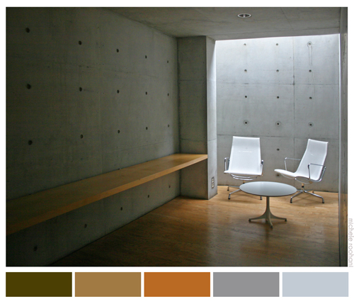
I like playing with colors and each photo I take has a unique palette; I was in Vitra some time ago and I liked the Japanese architect, Tadao Ando‘s, conference pavillion:
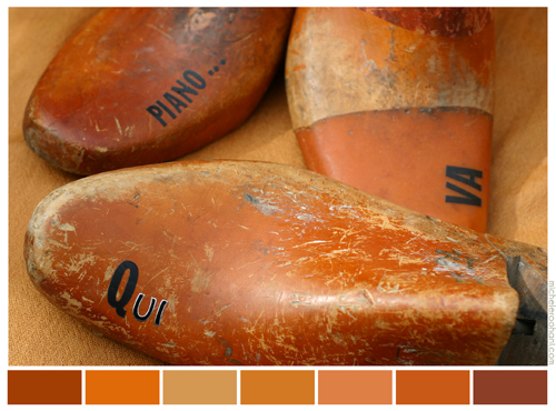
It’s a visual play for me to make the range of colors that create the image. The photo bellow is from my shoe trees that spell (erroneously): “Qui va piano” or “Chi va piano, va sano; chi va sano, va lonta” which means: He who goes softly, goes safely; he who goes safely, goes far.
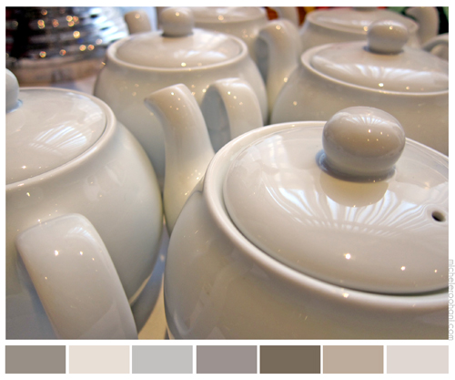
I love different shades of gray like these teapots:
and different whites of snow:
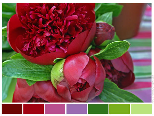
but I go nuts for flowers and their bursting energy like these gorgeous crimson peonies:
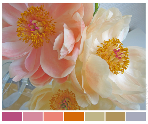
or their softer versions here:
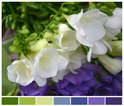
I like freesias’ scent and this particular palette has always been one of my favorites; I even used it in my senior year thesis, using a CAD machine to do a chemical plant’s process flow diagram! That was a first for my dear Professor Lockhart…
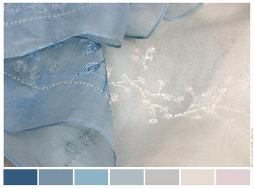
I like these shawls of mine even if I seldom wear them:
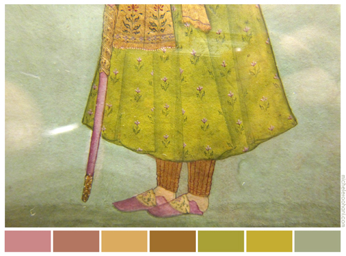
Indian miniatures are usually an orgy of colors!
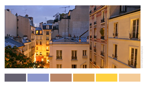
So is the Parisian dusk,
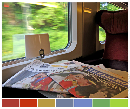
or the window of a fast moving train,
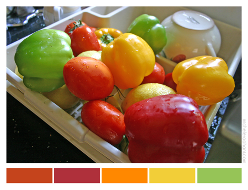
which mimics the palette of these summer vegetables.
This was a hodgepodge of my favorite palettes.
If I work enough,
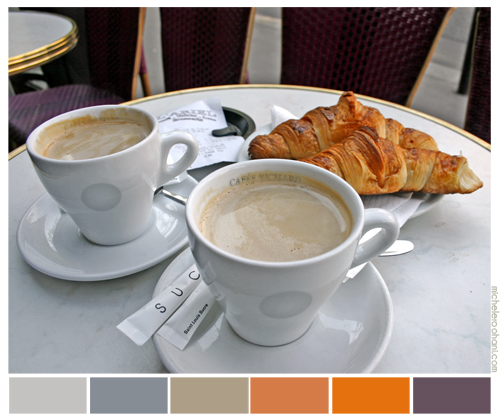
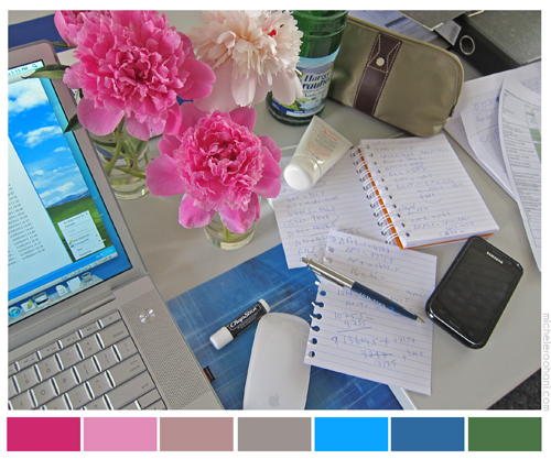 I may earn enough to deserve my coffee later!
My favorite “Reds” go here
Don’t forget my favorite “Whites” here

I’m so many times dreaming on colors, especially on flowers of course.
What you do for “fun” is poetic, very poetic, and I find in your palettes lots of colors I try to find when I do my photos.
Thank you once more for your creativity.
Dear Michele:
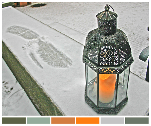
These are wonderfully beautiful palettes. There is architecture is your palettes as well. The architecture of the Japanese design is excellent and you have framed it even better. I like the light playing on the picture. Your peonies palette is awesome and so is the enhanced light in Parisian palette and lantern palette. Thank you for the beautiful job.
Well Michéle what can I say… an artist by heart <3 BEATIFUL I really love it & I have to confess that I miss you here in L.A. California. Thank you for sharing such a unique multiple rainbow that brings a smile to my life =) Ciao!
Brilliant!
Color is fundamental. It’s fascinating to me that bouncing electrons in each atom of paint can hop back from an orbital and create a beam of light that would travel through the air, reach the rods in our eyes, and make us see the deep blue of a Tahitian woman’s dress in a Gauguin painting or the splatter of fresh red blood on a matador’s sword, or the swirling almond color of a lover’s eyes. How remarkable that in a universe made up entirely of contrast, a lonely symphony made up of various shades of gray, color brings life and meaning at its crescendo. I love rich colors. They are like candy. You can almost taste them.
Cats can only see in black and white, and I suspect that’s why they have such an attitude! 🙂
Dear Michelle,
I was at a loss of words when I first saw the post .. However thanks to Ali I can connect my thoughts
Gorgeous, Creative and fascinating palette. The colors are Light made visible.
In the words of Van Gogh,
Colors expresses something by itself.
I quote from book by Leonard Shlain
While a consensus can be built about most other features of the world, there is only an uneasy, unspoken agreement among people about color. It is both subjective opinion and an objective feature o the world and is both an energy and an entity.
Color is tied to emotions as well being a fact The discursive and eloquent left side of the brain becomes stymied when attempting to describe the experience of color.
Thanks for making our Light Visible