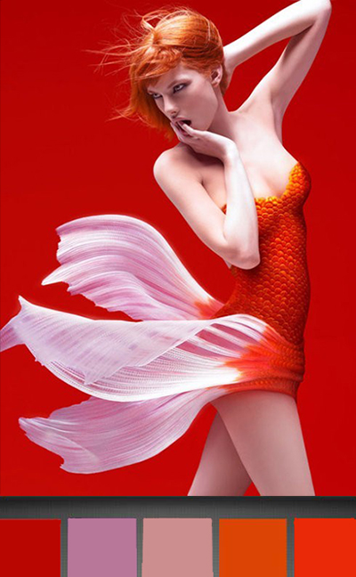
So I am crazy about my new Pantone app; it helps me find the colors that make me happy like these red/tangerine/persimmons on this sexy koi:
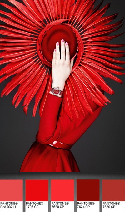
This gorgeous Dior hat is in my favorite color, RED!
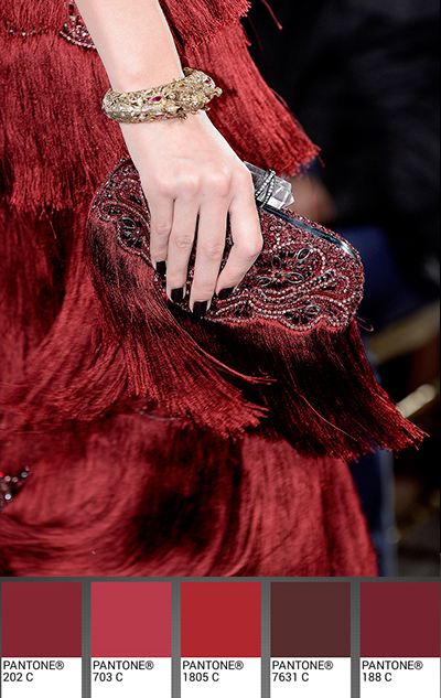
And this wine palette has all the colors of your favorite Bordeaux and Bourgogne:
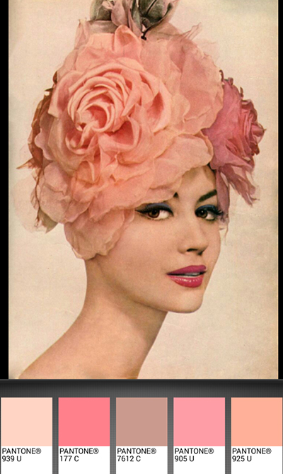
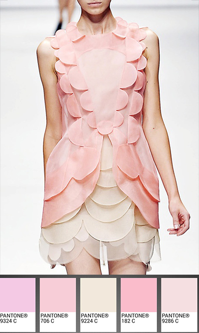
Let’s go to the pinks now with this “femme rose” from 1959:
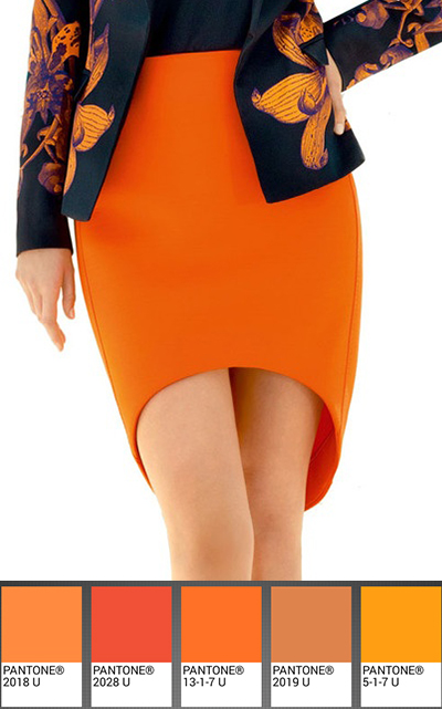
or this tangerine/ochre skirt that reminds me of Veuve Clicquot, my favorite champagne:
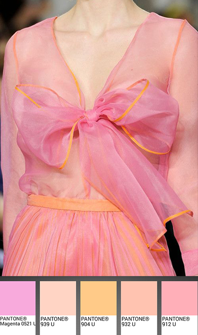
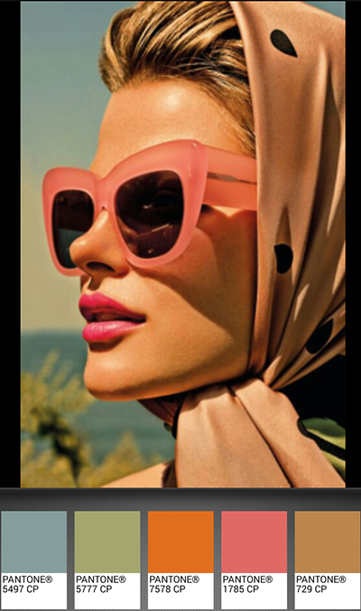
I love the combination of pink and orange like a romantic sunset:
and all shades of soft peach puffs,
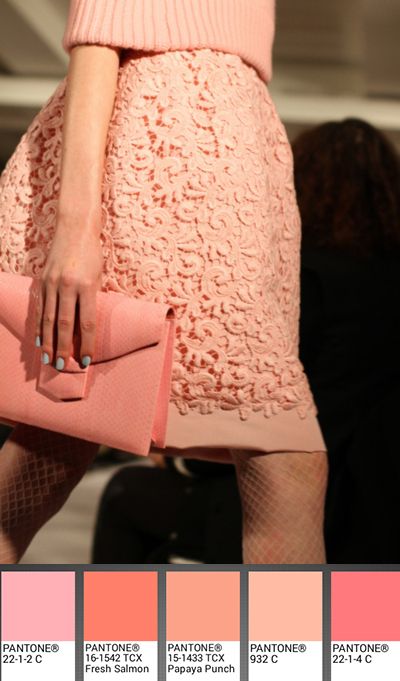
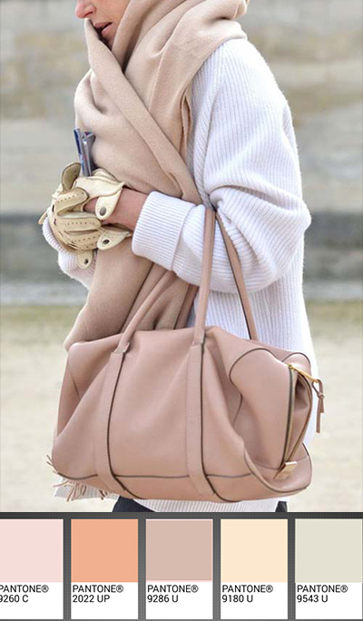
and this pretty tan/rose:
with its paler pastel cousin, rose smoke:
But let’s go back to happy cherry blossoms from Christopher Kane,
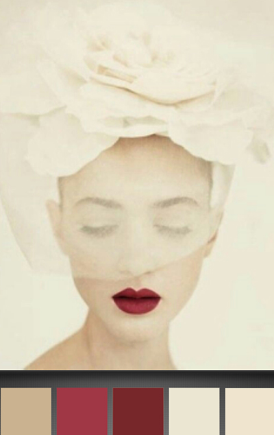
or these crimson cherry lips from 1950:
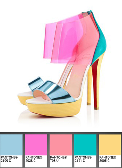
or these irreverent Louboutin shoes in pink flambé,
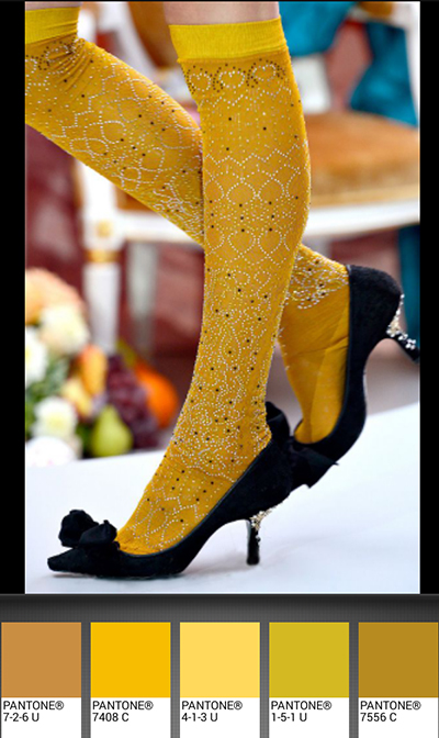
stunning mimosa socks, from Meadham Kirchhoff:
or this ultramarine green and pink combo. (All of these pictures and their sources are on my Pinterest page)
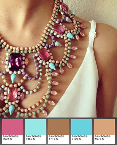
Funny but only after I made this following palette, I came to appreciate the necklace and its moca/turquoise/rose palette:
Now let’s explore the realm of moss/sage in this apparitioin by Elie Saab:
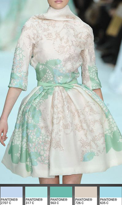
Look at this mint princess here:
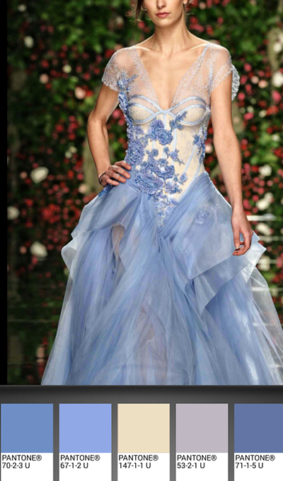
The periwinkle fairy:
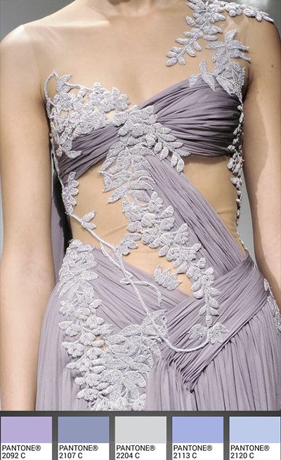
and the wisteria goddess from Marchesa:
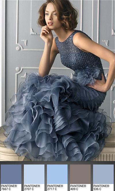
I love the steel blue on her,
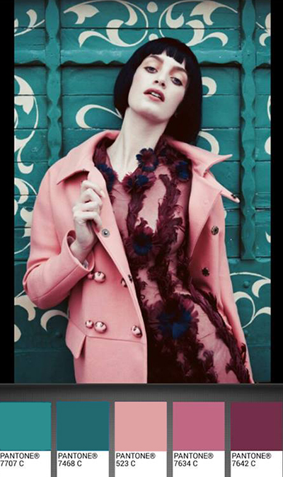
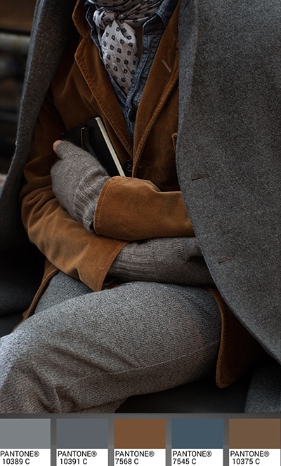
A little detour into more serious and warmer colors:
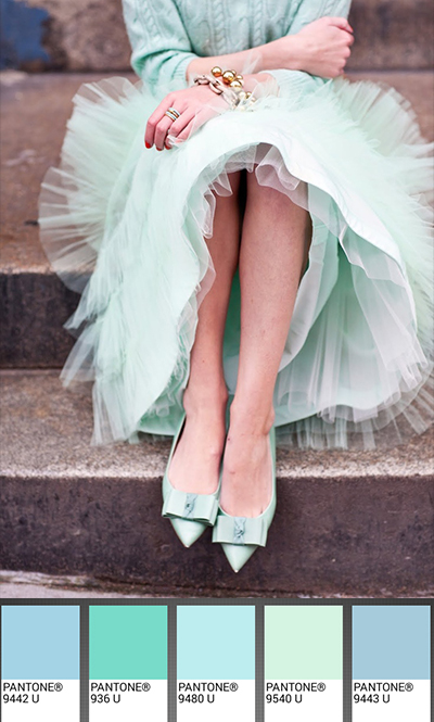
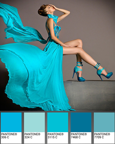
and back again into the flashy seafoams from Blanka Matragi:
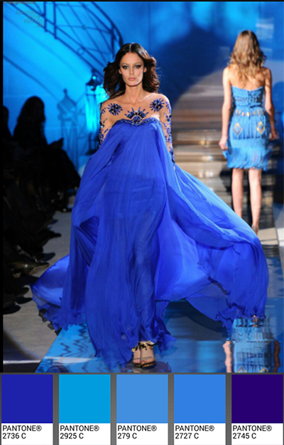
and royal blues:
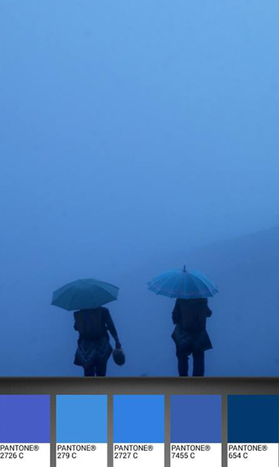
Blue being my other favorite color, I end this post with this quiet blue palette on a rainy afternoon in China photographed by Eric Lafforgue:
“Blue makes no noise.
It is a timid color, without ulterior motives, forewarning or plan; it does not leap out at the eye like yellow or red do, but rather draws it in, taming it little by little, letting it come unhurriedly, so that it sinks in and drowns in it, unaware.”
“Le bleu ne fait pas de bruit.
C’est une couleur timide, sans arrière-pensée, présage, ni projet, qui ne se jette pas brusquement sur le regard comme le jaune ou le rouge, mais qui l’attire à soi, l’apprivoise peu à peu, le laisse venir sans le presser, de sorte qu’en elle il s’enfonce et se noie sans se rendre compte de rien.” Jean Michel Maulpoix
mais quel régal! absolument délicieux de couleurs de mouvements de parfum enivrant le regard – MERCI!
You simply bring big joyful smiles
seared with warm rays of your reds
and penetrating cools of blues
to our beating hearts & thrilled faces.
Pouring showers of kind smiles upon you!
Unbelievable sense of color, thanks. 🙂
Beautiful pictures, beautiful colours, beautiful girls.
“I hear the question upon your lips: What is it to be a colour?
Colour is the touch of the eye, music to the deaf, a word out of the darkness. Because I’ve listened to souls whispering – like the susurrus of the wind – from book to book and object to object for tens or thousands of years, allow me to say that my touch resembles the touch of angels. Part of me, the serious half, calls out to your vision while the mirthful half sours through the air with your glances.
I’m so fortunate to be red! I’m fiery. I’m strong. I know men take notice of me and that I cannot be resisted.
I do not conceal myself: For me, delicacy manifests itself neither in weakness nor in subtlety, but through determination and will. So, I draw attention to myself. I’m not afraid of other colours, shadows, crowds or even of loneliness.
How wonderful it is to cover a surface that awaits me with my own victorious being! Wherever I’m spread, I see eyes shine, passions increase, eyebrows rise and heartbeats quicken. Behold how wonderful it is to live! Behold how wonderful to see. I
I am everywhere. Life begins with and returns to me. Have faith in what I tell you.”
― Orhan Pamuk, My Name is Red
Absolutely beautiful.. Thank you for yet another amazing blog
Fabulous…
Superbes photos.
Je note que le bleu est attirant. C’est sans doute pour cette raison que je privilègie le bleu ciel pour mes chemises ….
Does it work ?
What to say after Ajays’ post..
and such a wonderful poem
I will just say that colours live and love and cry and dream. They mourn in grey and black and red with gunfires, they flow in green as on the Steve mac Curry’s portrait of the Afgahn girl,
They rain in pink grey and pearl and shine sous le ciel de Paris, or in the eyes of Edith Piaf when she sings “plus bleu”.
They make a new rainbow with myriad of tones in the playgrounds of the schools between the deep
sky and the drought earth in Africa
May we continue to see and feel the colors as food for our eyes and love for life
You really are amazingly talented and always open to new possibilities. Good for you.
The blog is absolutely breath taking the colors vibrant and the pictures ALIVE.
Beautiful.
Thank you.
Uniquely creative ; that is you, Michele. Thank you for sharing.
Impressionant ton truc! Magique!
On dirait qu’il suffit de pianoter sur ces claviers aux touches de couleurs pour qu’il se dégage des notes multicolores.
Ca permet des subtilités, en combinant des nuances dans des compositions qui rendent l’image sublime. C’est presque surréel!
Ca parait simple, et pourtant malgrès tout a travers cette simplicité le talent se distingue et reste quand même roi.
Brava, Michele, this is gorgeous!
What a lovely nice post. I love the colors. It remind me of a poem I wrote many years ago on colors of life, a poetic perspective on the colors that fits to post here under this beautiful blog of yours. Thank you
Colors of life
Red, yellow, and blue,
Wine, honey, see-through,
Versus war, famine, curfew.
There is flood, shedding blood,
Some in the mud, thanking the God,
Some count the days, behind the rod.
There is orange, lots of brown,
The set of the sun, beauty of the dawn,
Class of the poor, class of crown,
The sad, and the bad, and the faking clown.
Green is the light, color of the peace,
Allowing to go, allowing to kiss.
Trees are plenty, forests are many,
Cutting all of them for the sake of money
Bright is the birth, so dark is the death,
The white like a bird, black like a hearth.
Color of the love, is the red, is the best.
It is wonderful when the birds form a nest.
The best of the all are colors of the life
The husband, the sons, and daughters with the wife
And I love the white, peace and joy not the fight,
We don’t need to fight if the mind is bright.
And I love the red, life alive not the dead.
We are like a dead, love-less life with dread.
Mehr 10/16/2001
Pingback: Colour Study // Sand | The Source of Inspiration
Pingback: Colour Study // Sand - YO Status
Hi,
Awesome post! Just wondering where the top koi picture is from?
THanks
It is from Christopher Gilbert (it’s on the description of the image if you hover your mouse over it, it will show it.)