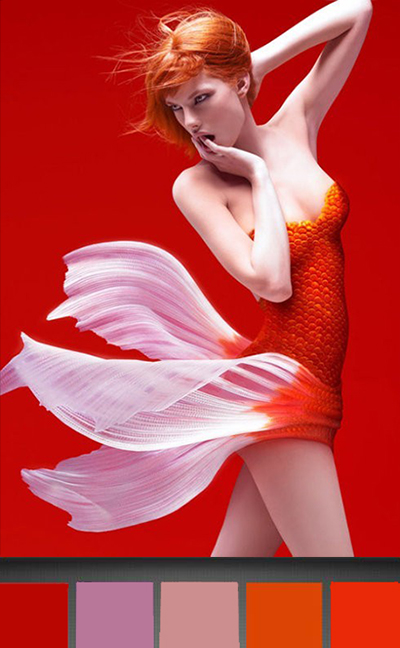
So I am crazy about my new Pantone app; it helps me find the colors that make me happy like these red/tangerine/persimmons on this sexy koi:
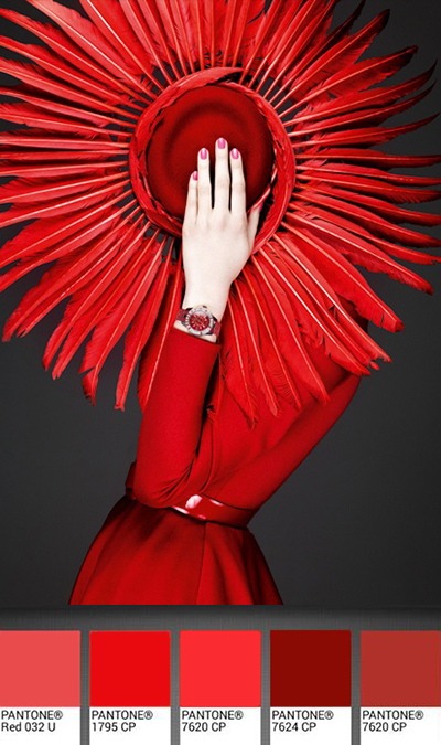
This gorgeous Dior hat is in my favorite color, RED!
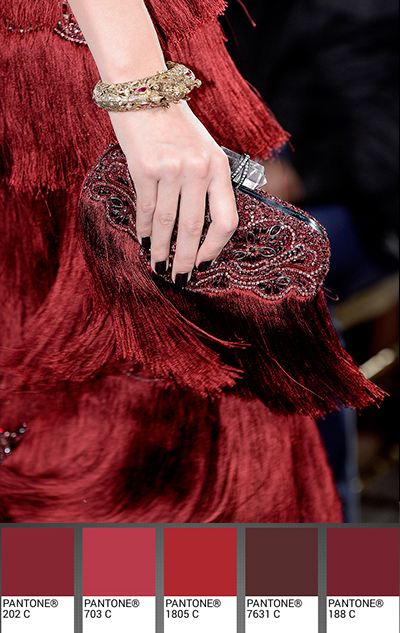
And this wine palette has all the colors of your favorite Bordeaux and Bourgogne:
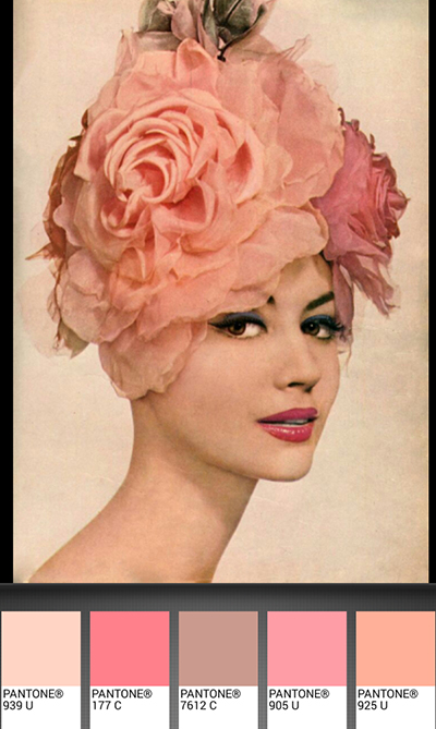
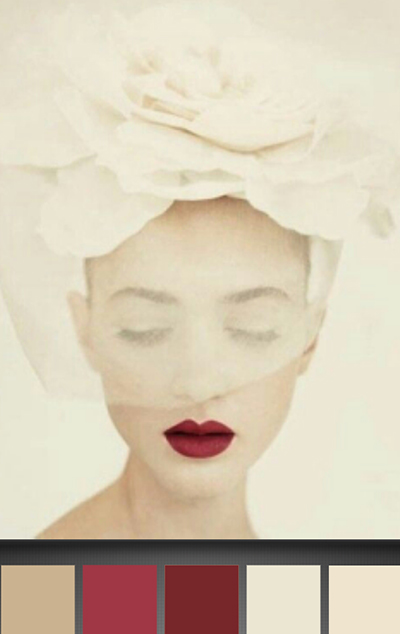
Let’s go to the pinks now with this “femme rose” from 1959:
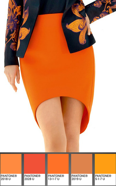
or this tangerine/ochre skirt that reminds me of Veuve Clicquot, my favorite champagne:
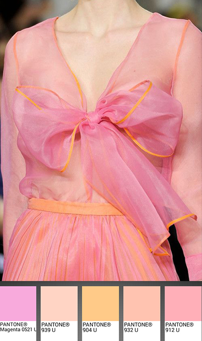
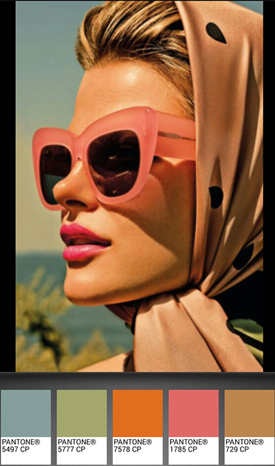
I love the combination of pink and orange like a romantic sunset:
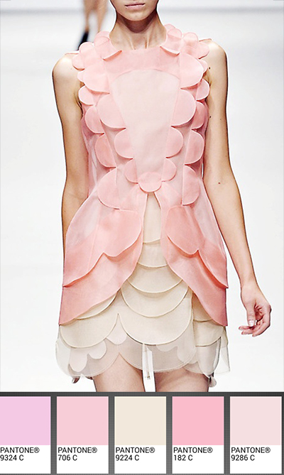
and all shades of soft peach puffs,
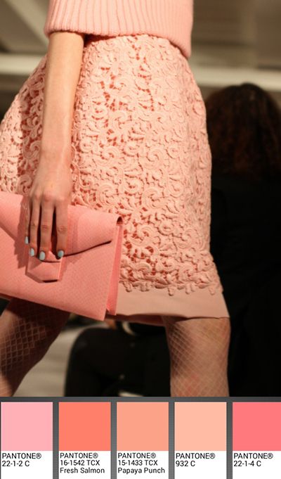
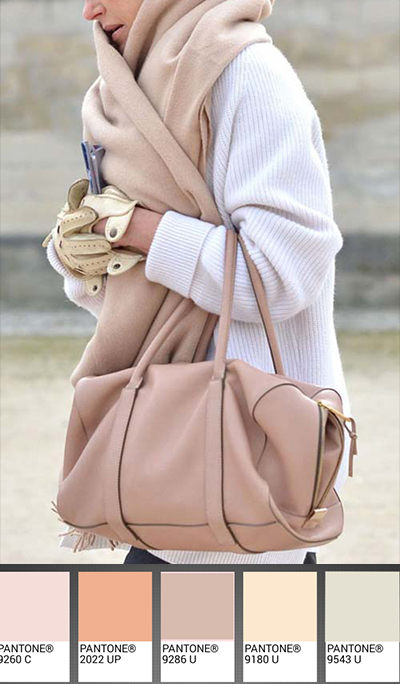
and this pretty tan/rose:
with its paler pastel cousin, rose smoke:
But let’s go back to happy cherry blossoms from Christopher Kane,
or these crimson cherry lips from 1950:
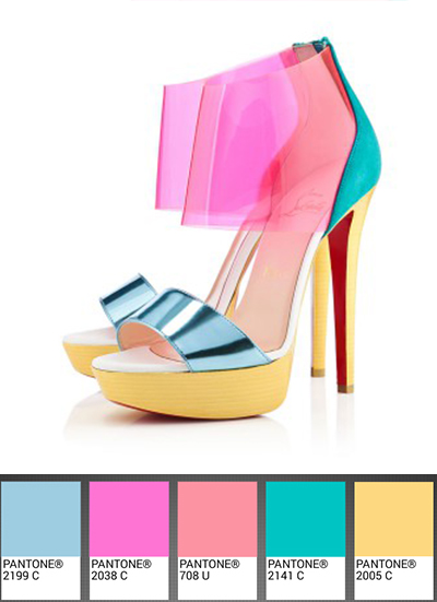
or these irreverent Louboutin shoes in pink flambé,
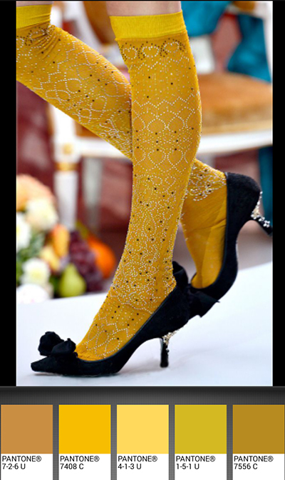
stunning mimosa socks, from Meadham Kirchhoff:
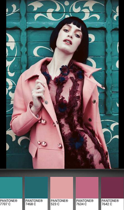
or this ultramarine green and pink combo. (All of these pictures and their sources are on my Pinterest page)
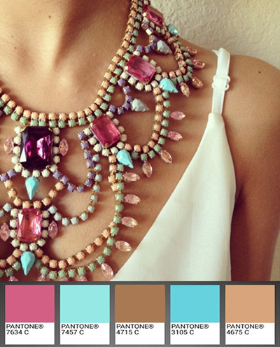
Funny but only after I made this following palette, I came to appreciate the necklace and its moca/turquoise/rose palette:
Now let’s explore the realm of moss/sage in this apparitioin by Elie Saab:
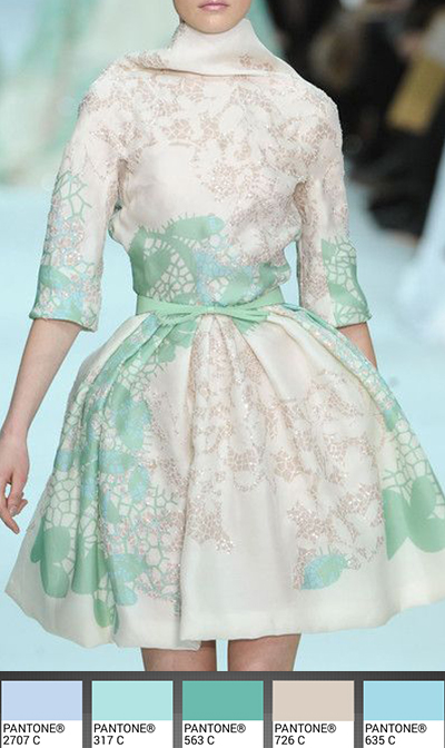
Look at this mint princess here:
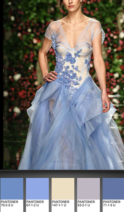
The periwinkle fairy:
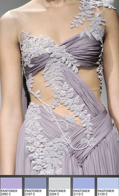
and the wisteria goddess from Marchesa:
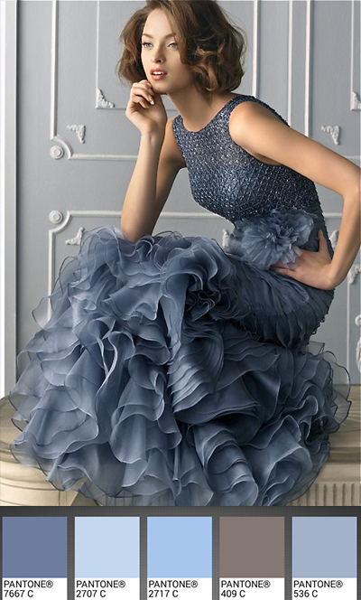
I love the steel blue on her,
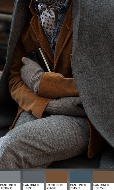
A little detour into more serious and warmer colors:
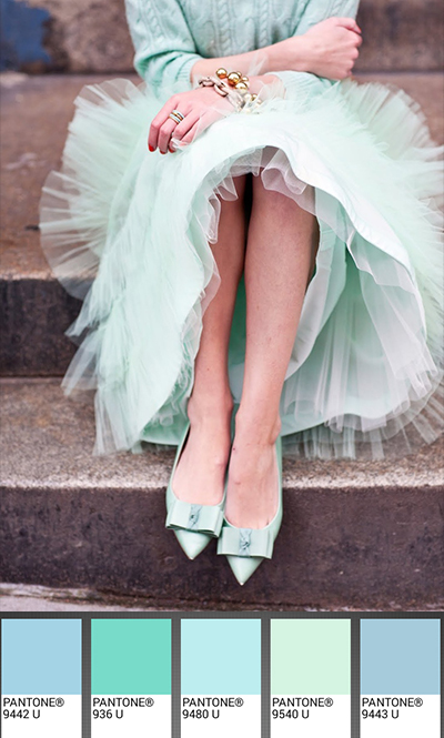
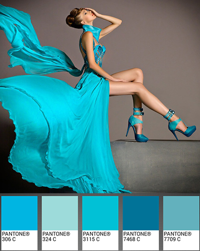
and back again into the flashy seafoams from Blanka Matragi:
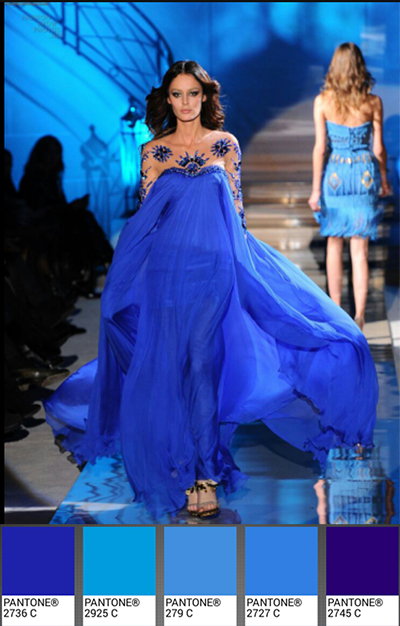
and royal blues:
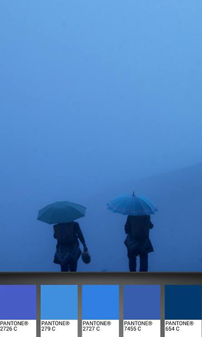
Blue being my other favorite color, I end this post with this quiet blue palette on a rainy afternoon in China photographed by Eric Lafforgue:
“Blue makes no noise.
It is a timid color, without ulterior motives, forewarning or plan; it does not leap out at the eye like yellow or red do, but rather draws it in, taming it little by little, letting it come unhurriedly, so that it sinks in and drowns in it, unaware.”
“Le bleu ne fait pas de bruit.
C’est une couleur timide, sans arrière-pensée, présage, ni projet, qui ne se jette pas brusquement sur le regard comme le jaune ou le rouge, mais qui l’attire à soi, l’apprivoise peu à peu, le laisse venir sans le presser, de sorte qu’en elle il s’enfonce et se noie sans se rendre compte de rien.” Jean Michel Maulpoix